Anatomy of icicle and flame graphs
In the simplest terms, an icicle graph or a flame graph shows a program's call stack. But what does that mean?
Anatomy of a single profile
Structure
The graphs represent the call stack data as a series of horizontally-aligned rectangles. Each rectangle corresponds to a function, and its width represents the time spent in that function, including the resource (time, memory, etc.) used in its child functions.
The rectangles are stacked on top of one another, with the parent function at the bottom and the child functions above it. The hierarchy and the relationship between different functions can be easily understood by following the vertical alignment of the rectangles.
The critical aspects of icicle and flame graphs are:
- The width of each rectangle represents the relative resource usage for a function, including the time spent in its child functions.
- The height of the rectangles does NOT represent anything. The vertical alignment of the rectangles is used to describe the call stack hierarchy.
Colors
In both icicle and flame graphs, colors are used to visually differentiate functions and make the graphs more readable. The colors usually do not carry any specific meaning related to performance data. Instead, they are chosen to make distinguishing between different functions and their relationships within the call stack hierarchy easier.
Typically, colors are assigned randomly or based on a hashing algorithm applied to the function names. This ensures that adjacent rectangles representing different functions have contrasting colors, making it easier to identify and trace individual functions within the graph.
However, some tools may allow you to customize the color scheme or use colors to represent additional information, such as memory usage or specific categories of functions (e.g., I/O-bound, CPU-bound, etc.).
In such cases, the color assignments and their meanings depend on the specific tool or configuration used to generate the icicle or flame graph. Always refer to the documentation or legend accompanying the graph to understand the color representation if it carries any specific meaning in your particular case.
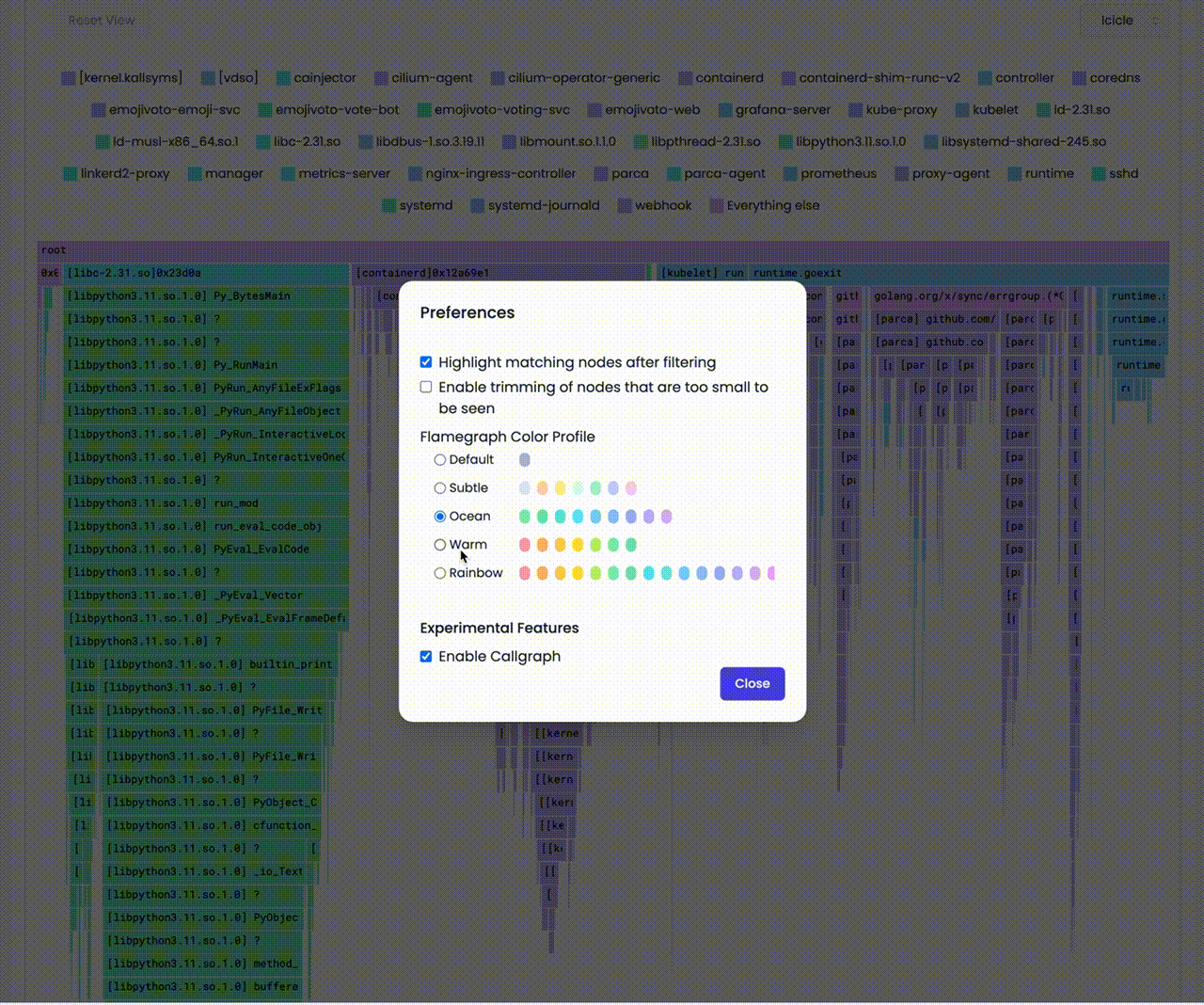
For example, in parca.dev we use the following color palette for icicle graphs:
Conventionally, the top-to-bottom order of the call stacks looks like icicles. And the color palette is chosen from rather cold colors.
On the other hand, the bottom-to-top order of the call stacks looks like flames. And the color palette is chosen to represent a flame.
The colors usually do not carry any specific meaning related to performance data.
If the rectangle are red in color, it does NOT mean that the function is taking relatively more resources.
Easy, right? Let's see how we can visualize a single call stack collected from a program.
Walk-through
Let us see how we can visualize a single call stack collected from a program.
The following program calls a function a which calls a function b which calls a function c and then loops forever.
package main

func c() {
    for {}
}

func b() {
    c()
}

func a() {
    b()
}

func main() {
    a()
}
The colors usually do not carry any specific meaning related to performance data.
When we profile the above program for let say 50ms, we get the following profile represented as flame or icicle graph.
- Icicle
- Flame
The key aspect of icicle graphs is that they are drawn from the top to the bottom.

The key aspect of flame graphs is that they are drawn from the bottom to the top.

Even though, in this example, the majority of time is spent in the function c, all the rectangles have the same width.
Let's add more calls to c and see how the graph changes.
package main

func c() {
-    for {}
+    for i := 0; i < 1_000_000; i++ {}
}

func b() {
    c()
+    c()
+    c()
}

func a() {
    b()
}

func main() {
    a()
}
- Icicle
- Flame
The key aspect of icicle graphs is that they are drawn from the top to the bottom.
The key aspect of flame graphs is that they are drawn from the bottom to the top.
It doesn't seem like something has changed, right? Why is that?
This is called merging. Even though, it takes more time to execute the function calls in total, relative to the other functions, the width of the rectangle for c remains the same.
It doesn't matter how many times we call the same function at the same level.
We will discuss this in detail later.
Let's go back to the original program and add a call to a new function d and e in the function b.
```diff
package main

func c() {
    for i := 0; i < 1_000_000; i++ {}
}

+func d() {
+    for i := 0; i < 1_000_000; i++ {}
+}
+
+func e() {
+    for i := 0; i < 1_000_000; i++ {}
+}


func b() {
    c()
+    d()
+    e()
}

func a() {
    b()
}

func main() {
    a()
}
You can see that the rectangle for the function b is now have three rectangles as its children.
And the rectangle for the function b covers them call.
b represents the time spent in the function b and its child functions.- Icicle
- Flame


In a similar manner, let's re-arrange the code a bit. We will move the call to c from the function b to the function a.
And we will add a call to the function f in the function b. And have a c exactly the same as b.
The code will look like this:
package main

func c() {
-    for i := 0; i < 1_000_000; i++ {}
+ d()
+ e()
+ f()
}

func d() {
    for i := 0; i < 1_000_000; i++ {}
}

func e() {
    for i := 0; i < 1_000_000; i++ {}
}
+
+func f() {
+    for i := 0; i < 1_000_000; i++ {}
+}
+
func b() {
-    c()
    d()
    e()
+    f()
}

func a() {
    b()
+    c()
}

func main() {
    a()
}
You can see that the rectangle for the function a is now have two rectangles as its children.
And the b and c rectangles are now children of the a rectangle. And the d, e and f rectangles are now children of the b and c rectangles.
But the leaf rectangles are not merged.
Hmm, why is that?
It's because even though the functions
d,eandfare same and are in the same level, they are not called from the same function.
They have different parents/ancestry. So, they are not merged.
- Icicle
- Flame


This is how we visualize a single call stack collected from a program. But happens when we collect multiple call stacks over time?
Let's see.
Anatomy of Continuous profiling
In the life-cycle of a program, there are many call stacks. Even in a second, a program can have thousands of calls and in a profile that we collected from a program for a minute, there can be millions of call stacks. And when you profile a host with multiple programs running, there can be billions of call stacks.
We need to reduce collected data to feasibly manage it. For that we take samples of call stacks for a given interval and then aggregate them.
There are three major steps in the process of aggregating call stacks and building a profile. Let's see them one by one. And visualize the process with animations using the graphs.
Sampling
Sampling is the process of taking a sample of call stacks for a given interval.
You can see below that we take samples for a given interval (e.g. 50ms), over a period of time (e.g. 1 minute).
- Icicle
- Flame
Sorting
We sort the samples alphabetically, because even the samples are taken for a given interval are aggregated and the order of the samples is not guaranteed. And our goal is to determine the bottlenecks of the programs. Thus we do not need to keep the order of the samples.
- Icicle
- Flame
Merging (Grouping)
Lastly, we merge the samples that have the same call stack.
We do not merge the samples that have the same function name, even if they are in the level.
- Icicle
- Flame
Let's see everything together.
- Icicle
- Flame
This is how a profile collected and represented in icicle graphs or flame graphs can provide valuable insights into the performance of your software, enabling you to identify bottlenecks and optimize code effectively.
By visualizing the call stack data clearly and intuitively, these graphs make it easier for developers to understand the complex relationships between functions and their resource consumption.
Whether you choose to work with icicle graphs, which emphasize cumulative time spent in functions and their children, or flame graphs, which focuses on the self-time of individual functions, these powerful visualization tools can significantly enhance your ability to analyze performance data, and improve your software's performance and user experience.
We hope you enjoyed this article and learned something new :)